

Albin O. Khun Library Redesign
The University of Maryland, Baltimore County (UMBC) is a public research university in Baltimore County, Maryland. The university opened its doors in 1966, and the Albin O. Kuhn Library and Gallery opened in 1982 and named it in honor of Dr. Albin O. Kuhn, the first chancellor of UMBC. As the researcher for the project, I am providing an overview of the homepage redesign, the Study Spaces, Lockers & Specialty Rooms Info page, and the Space Availability webpage with Figma as our design tool.
Overview
The University of Maryland, Baltimore County’s (UMBC) Albin O. Kuhn (AOK) Library and Gallery website serves students, faculty, staff, researchers, scholars, and residents in the surrounding area. It provides resources, services, and support for research, teaching, and learning across various disciplines. The homepage offers quick access to the library’s catalog, databases, research guides, and essential resources. Users can search the catalog, access digital collections, and utilize services such as reference assistance and interlibrary loan. The website also features information on the library’s hours, policies, collections, special collections, archives, and galleries. Overall, it is a valuable resource for its diverse user base, offering easy access to collections and services and information on library operations and activities.


Known Problems
Poor navigation, search functionality, outdated information, and cluttered interface are among the general problems with the site:
The website's navigation may be difficult for those unfamiliar with the structure, making it harder for users to find the required information.
Users may need help finding the information required if the search functionality has confusing functions.
Some outdated information on the website may confuse users who rely on it for current information.
The interface is cluttered with extra information that distracts the user and overwhelms the interface.
Inspiration

William University
University of Denver
Our design maintains UMBC's authenticity with the black and gold color combination. Williams University's site has a minimalistic design, with library hours placed in a small section at the top left corner. The search bar has dropdown menus for organization and an "Advanced Search" section. In contrast, the University of Denver's site has a crowded top bar menu with seven categories and vertical dropdowns. UMBC's site features a prominent search bar, easy-to-find links, an events section, and a rotating information carousel.
The Homepage


Current Versions of the Homepage
Changes made for Hi-Fi Design:
The home page features the top menu, search bar, secondary menu, and event information. The “Library Hours” option was highlighted to show selection, and a decluttered box of hours information was displayed. The UMBC black and gold is maintained for style-guide consistency, and the UMBC library image gives some familiarity and connection to the site. The page is decluttered, displaying only essential information to the user, like the upcoming events, the current and future hours, and only one search bar. The user can get more information about the hours by clicking the Full-Service Hours link at the bottom. It is also possible to reach a more extensive search engine using the Filter option on the search bar. The information does not overload the user; they can still access more detailed information.

Hi-Fi Redesign of the Homepage
The Study Spaces, Lockers & Specialty Rooms Info Page
Inspiration
University of Maryland
University of Denver
The Study Spaces, Lockers & Specialty Rooms pages on the three library websites have distinct differences in their design. UMD's page presents a comprehensive list of available study spaces that can be filtered by location, room type, and available technology, with clear and easy-to-read information. In contrast, DU's page requires users to navigate multiple pages to access information on individual study spaces, each with a photo and description. UMBC's page is similar to UMD's but also includes a map of the library, which can help find specific locations. UMD's page is the most user-friendly for finding available study spaces, while UMBC's map feature enhances usability. DU's page could be improved for ease of use due to the multiple clicks required to access information.

Current Versions of the Study Spaces, Lockers & Specialty Rooms
Changes made for Hi-Fi Design:
The study room page is given a home page navigation option––the drop-down “Using the Library” has Study Spaces & Lockers. After clicking this option, the user is taken to the information page. Based on feedback, we added filter options, including Group Study, Quiet, Computers, etc. An example of a selected option (Group Study) with the shortened list is represented. The shortened list assists previous frustrations users had when the information was overloaded and it was hard to remember the different room options available. The text is also minimized to continue this effect.

Hi-Fi Redesign of the Study Spaces, Lockers & Specialty Rooms
The Space Availability Webpage
Inspiration
University of Maryland
The space availability pages of UMD and UMBC library websites share some similarities in design but also have some differences. Both sites show a list of available rooms and their corresponding times. However, UMD's page arranges the available rooms by location and has several filters, such as date, time, room type, and capacity. The page uses a table format, with each row representing a room, each column a time slot, and colors to indicate availability. Conversely, UMBC's page organizes available rooms by building in separate sections, with filters for date, time, capacity, and room type. Each room is listed with its name, capacity, and availability; detailed information is available by clicking on a room. While UMD's page has a more visually appealing design with hover-over information, UMBC's page is more straightforward to navigate with its clear organization by building and detailed room information.

Current Versions of the Space Availability
Changes made for Hi-Fi Design:
The reservation page is digitized with colors to fully imagine the room reservation table. The filters list is included on the left and is automatically there for easy access. The filters are salient and hard to miss. An example of a filter selection is given (Group Study), and the list of rooms is reduced. The filters reduce the table to aid memory and not overwhelm the user. The rooms can be deselected, eliminating a problem that users previously faced, where they had to scroll down to deselect options in a separate interaction.
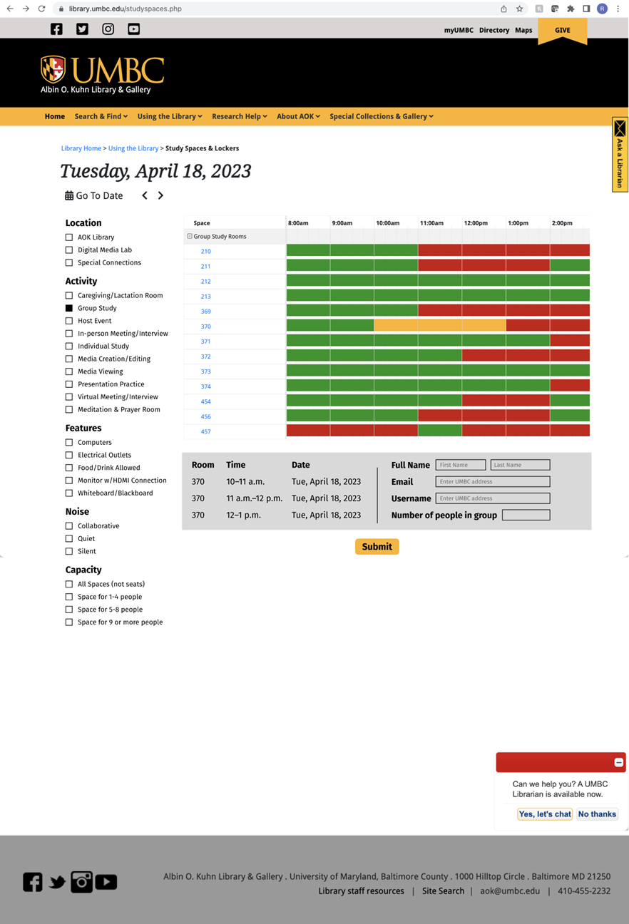
Hi-Fi Redesign of the Space Availability
Key Findings
After conducting cognitive walkthroughs with two UMBC students to evaluate our prototype, each student completed specific tasks related to the website's usability, providing valuable feedback. Based on this feedback, the medium-fidelity prototypes showed significant improvement, with enhancements such as highlighted buttons and labeled filters. However, there are areas for further improvement, including adding a confirmation page and a key for reservation rooms. Feedback from users helped us gain insights into the design process and inspired us to explore innovative solutions while maintaining UMBC's identity. While obtaining feedback posed some challenges, it was crucial for refining our design. We acknowledge the importance of continuing to gather feedback to ensure our design meets user needs comprehensively. Despite some unexplored features, we are satisfied with our progress and confident that our prototype enhances the UMBC AOK library experience.