

American Legion Auxiliary
American Legion Auxiliary members help military families cope with the effects of multiple deployments by focusing on advocacy, military and family support, and youth development. This project blends nostalgia with innovation using Figma. This redesign aims to prioritize transparency and accessibility, embrace a community across generations, and craft a digital legacy for the Legion.
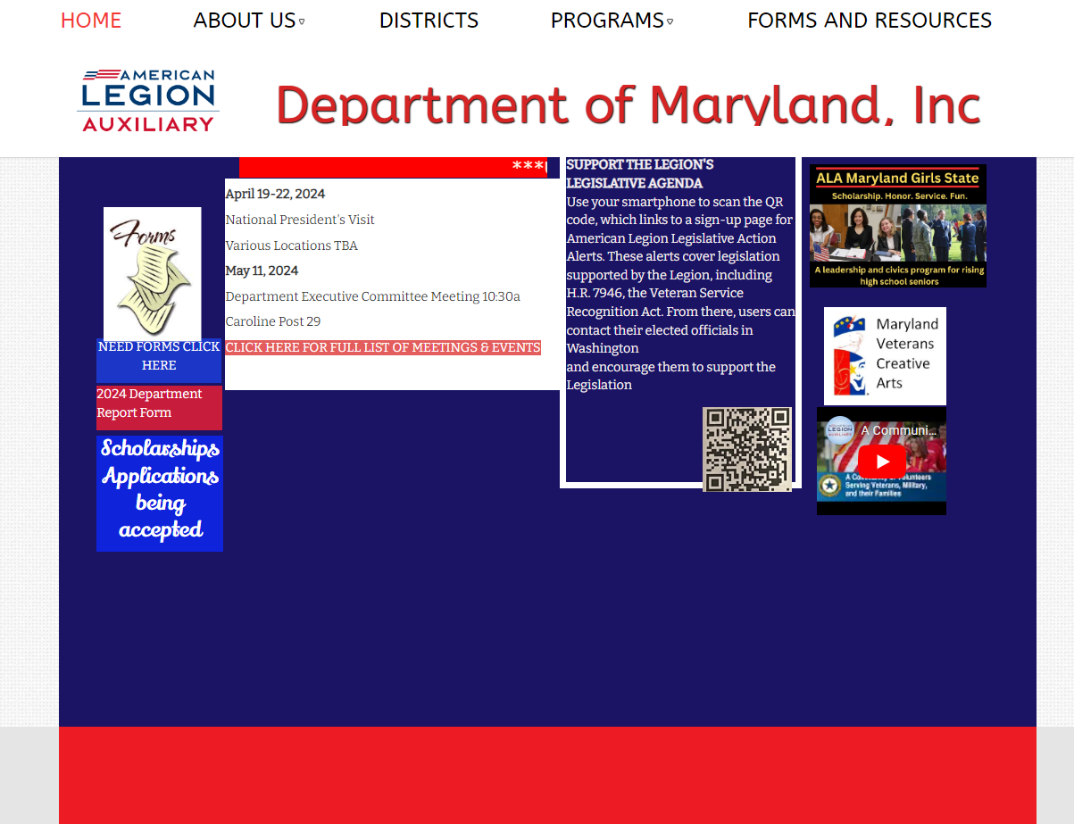
Homepage
I redesigned the homepage for the ALA website to use the modular grid type. A modular grid system is a structured layout used in design to organize content consistently and visually appealingly. It divides the layout into columns and rows, creating a balanced structure for placing elements. This grid type is highly versatile, providing a framework for arranging various content elements like images, text, and interactive components. The modular grid system allows for flexibility in design, ensuring a cohesive and organized appearance while offering adaptability for different screen sizes. It's particularly fitting for websites or applications where content needs to be systematically arranged and displayed, offering users a sense of order and clear visual hierarchy. For this website, we focused on showing what the Legion is about and all the other organizations that make up the Legion family.


About Us Page
I redesigned the About Us Page for the ALA website to the block grid. This approach organizes content into fixed-size blocks, offering a structured and visually appealing layout. Dividing the page into sections facilitates the arrangement of diverse content elements such as images, text, and interactive components. The block grid design ensures consistency and adaptability across different screen sizes, providing a cohesive and organized appearance. This redesign emphasizes clarity and hierarchy, effectively showcasing the Legion's mission and affiliated organizations while enhancing user experience through intuitive navigation and visual coherence.

District Page
I redesigned the district page for the ALA website and added it to the card grid. A card grid layout is a design approach where content is organized into separate, individual 'cards' that contain specific information or functionalities. These cards, often uniform in size and shape, offer a modular and flexible structure. They allow content to be presented in bite-sized, digestible portions, facilitating easy scanning and interaction. Card grid layouts are suitable for various platforms, from mobile to desktop, providing a responsive and adaptive design. They enhance the user experience by offering a clear visual hierarchy, aiding content categorization and prioritization. This approach allows for a versatile and organized presentation of diverse content types, promoting an engaging and user-friendly interface. This page will make it easier to sort from the list of forms and resources the users may need, with the option to filter or directly search for them.


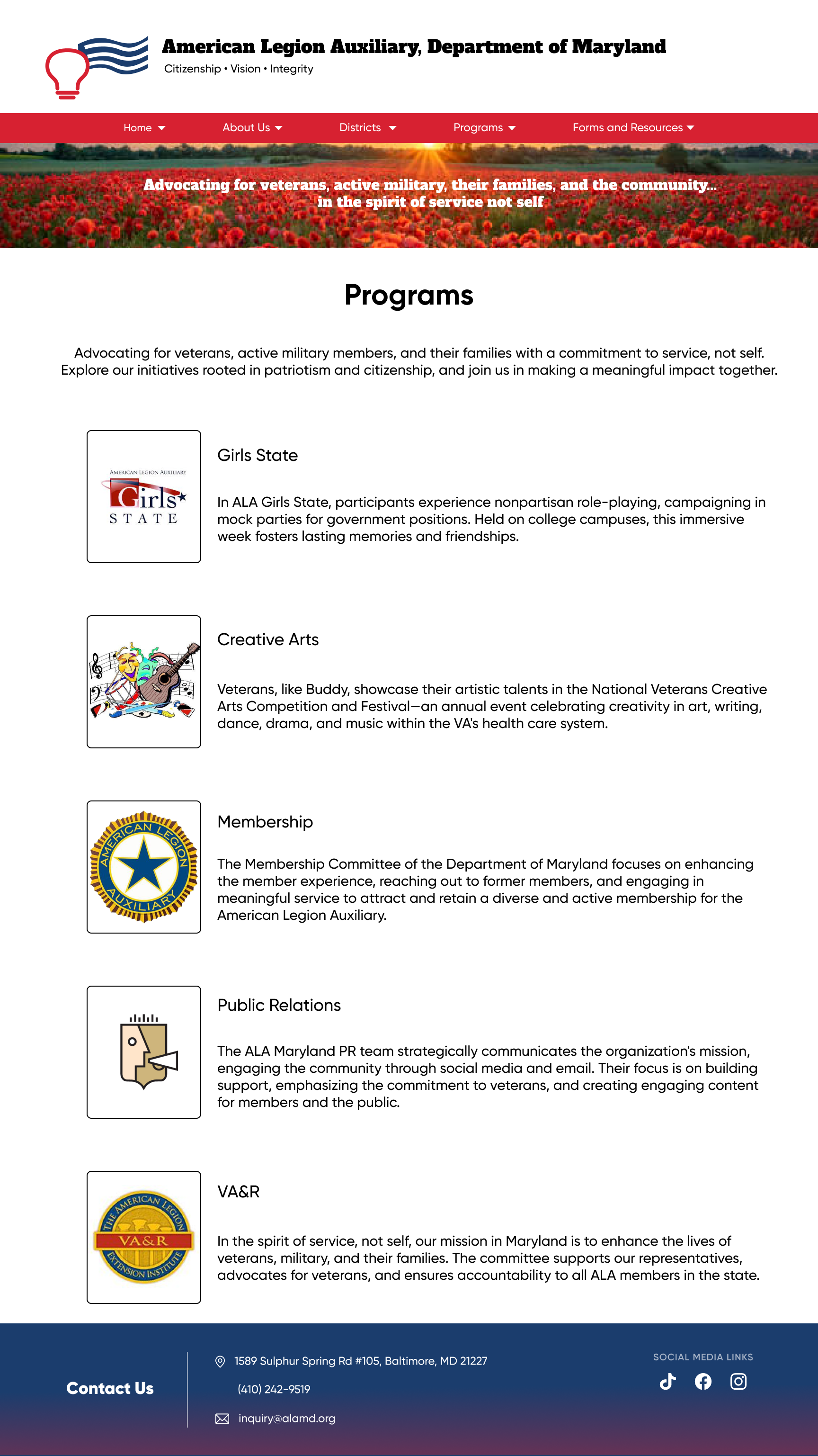
Programs Page
I redesigned the Programs Main Page for the ALA website to the hierarchical grid with a touch of modular grid. A hierarchical grid system, coupled with a touch of modularity, is a robust layout structure for organizing content by emphasizing visual hierarchy and consistent arrangement. Employing a hierarchical grid categorizes and prioritizes information, allowing for the placement of more critical elements, such as headlines or featured content, prominently within the layout. Simultaneously, the modular aspects enable flexible content placement within these designated hierarchical sections, ensuring a balanced and visually appealing display. This hybrid approach allows for a clear display of information according to its importance while retaining the flexibility to adapt content modules based on screen size and requirements, contributing to a well-structured and adaptable design for various platforms. The title cards are the programs offered that will take them to either sites that support the programs or take you to the details within the site.

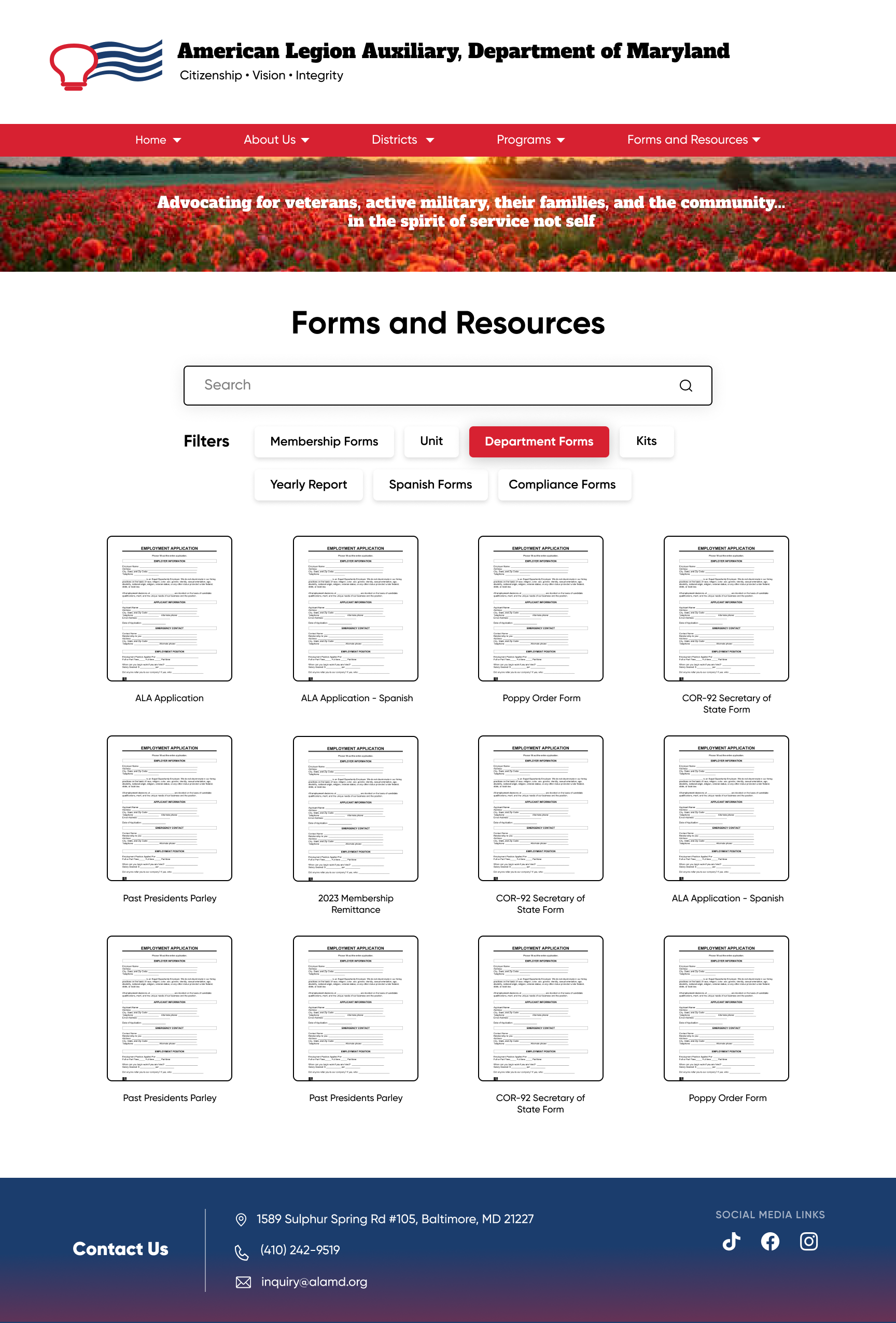
Forms and Resources Page
I redesigned the Forms and Resources Page for the ALA website to the card grid. A card grid layout is a design approach where content is organized into separate, individual 'cards' that contain specific information or functionalities. These cards, often uniform in size and shape, offer a modular and flexible structure. They allow content to be presented in bite-sized, digestible portions, facilitating easy scanning and interaction. Card grid layouts are suitable for various platforms, from mobile to desktop, providing a responsive and adaptive design. They enhance the user experience by offering a clear visual hierarchy, aiding content categorization and prioritization. This approach allows for a versatile and organized presentation of diverse content types, promoting an engaging and user-friendly interface. This page will make it easier to sort from the list of forms and resources the users may need, with the option to filter or directly search for them.
Conclusion
For my semester project, I have chosen to focus on redesigning the website for the American Legion Auxiliary Department of Maryland. The primary purpose of this website is to support and advocate for veterans, active military personnel, and their families. Additionally, it provides valuable educational and leadership opportunities that uphold the ideals of freedom, democracy, and patriotism in government. You can access the current website through this link:
http://www.alamd.org/index.html.
My motivation for undertaking this redesign project stems from a personal connection to the American Legion Auxiliary. When I moved to the United States in 2015, I had the opportunity to participate in the American Legion Auxiliary, Maryland, Girls State program (ALAMDGS).
This experience was transformative, helping me develop essential interpersonal and public speaking skills. Although I continue to support the program to the best of my abilities, my involvement has decreased due to academic and work commitments.
Something that I like about the website is its simplicity. I want to keep it simple but make it flow better. The current website poses some design challenges. It houses a multitude of resources that can be overwhelming for users of various age groups, ranging from as young as 13 to 65-year-olds to veterans. My goal in this project is to create a more organized and user-friendly website that ensures seamless accessibility, simplifying the navigation process for its diverse audience.